In the previous part, we have talked about the first four e-commerce design prediction for 2019. And in this article, we will continue to discuss the rest five.
5. Asymmetry
What is asymmetry?
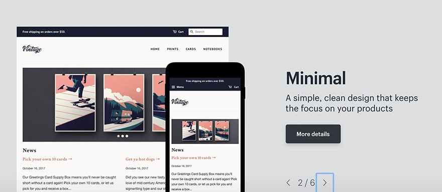
Nowadays, with the popularity of basic template building sites like Squarespace and Wix, website owners are looking for ways to differentiate them from regular cookie cutter sites, even if they themselves are using the template maker. And one effective way to set yourself beyond the others is using an asymmetrical layout.
Asymmetry is the lack of symmetry or equality between two halves. However, it is not a lack of balance as some wrongly assume. Designers can still use asymmetry to create balance and harmony even though two sides of the design do not mirror one another.
What it means for e-commerce?
Asymmetry can be one of the most impactful concepts in your design toolkit. Because all the product pages are appealing to use the usual layout, which helps you keep everything within. But for brands that want to be sharp or unique, pages with heavy structures can do more harm than good.
In this case, asymmetry is active and grabs attention. Note when using asymmetry layout is product information is there and can be easily found.
6. Serifs
Definition of Serif
Serifs are any of the short lines stemming from and at an angle to the upper and lower ends of the strokes of a letter. The dominance of minimalism in web design over the past few years has made the serif typeface become less popular. But in recent months, we are seeing the revival of these fancy fonts.
Opposite of Serifs, Sans Serif is a popular choice for blogs and other online text blocks because they are thought of as more modern and contemporary. Their simplicity makes reading easier on the eyes. However, Serifs add a certain classic charm and sophistication, as long as they are used sparingly. Serifs are a good choice if you want your brand to have a more dignified appearance.
How to apply Serifs in e-commerce?
Serifs won’t fit for all brand but it can help set up a suitable atmosphere for the right match. However, we recommend using Serif fonts only for headings and titles. They will be better to highlight certain areas than for legibility because it is a style of decoration. With text blocks like product descriptions, you should still prefer Sans Serif style.
Have you took a look at the previous part: The Top 9 Design Trend Prediction for 2019 Part 1
7. Diversity
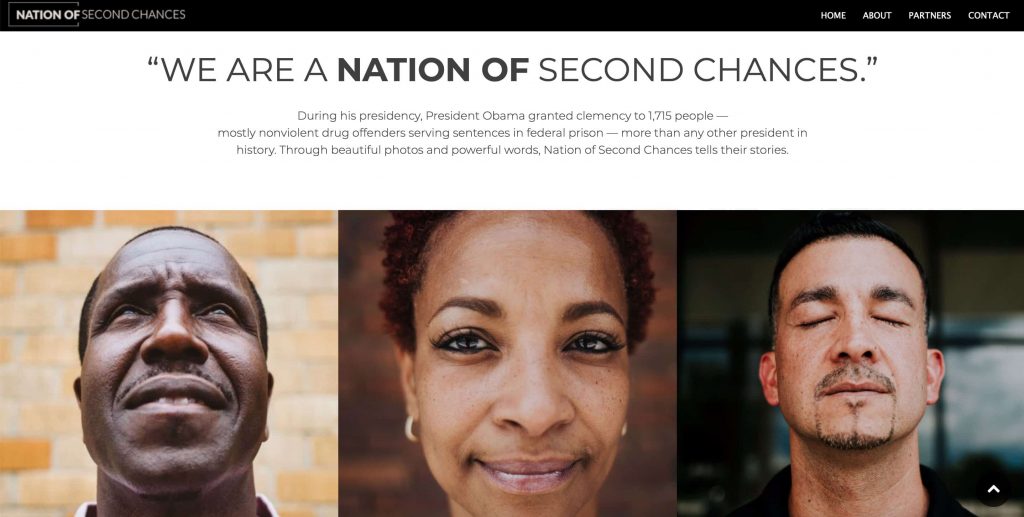
We have seen some digital trends that are drawn directly from what’s happening in the real world today. As a result of the social upheaval in recent years, there is more diversity on the Internet and brands are catching the trend.
The diversity in web design is expressed in a few different ways:
- a wide range of ethnic groups represented in photography
- depictions of homosexual couples
- gender-sensitive language (i.e., “salesperson” not “salesman”)
- overt messages of support to minority groups
If a company wants to come across as more progressive and inclusive, it now can post content that has been controversial 20 years ago. It is more regular to see the images of homosexual couples and the representation of diverse racial groups. These pictures are in both computer-generated images and real-life photography. Even a copy of the site is adapting, with the use of more sensitive gender terms and sometimes publicity of support messages for minority groups.
What it means for e-commerce
Regardless of what demographic your business is targeting, it is best to represent a diverse range of groups on your site. You can apply it not only in your product photo models but also in support messages on your social media or website.
8. Vintage Photography

While some brands are looking ahead with next-level technology and sci-fi imagery, other brands deliver a classic and dignified atmosphere by using vintage styles. It’s easy to catch a fashion photo using a muted color palette reminiscent of the gritty, low-fi photography of the 70s. Colors are also more saturated with black than other modern styles, highlighting the look of “the good ol’ days.”
As we have said above that this trend is not fit for every brand. In any case, if your site can profit from a grittier or retro atmosphere, it could be worth putting resources into a complicated photographer for thematic photos. This doubles for designer retailers, as stylistic images can represent the moment of truth about how your apparel comes across.
9. Contextual Logos
Logo designers must not only create aesthetically pleasing designs but must also have a deep understanding of the different contexts in which those designs might be applied. A logo can be shown up in many places such as posters, business cards, signs, installations, advertisements, and packaging,…In 2019, keep your eyes on the increase of awareness of context in logo design.
While responsive logos refer only to logos that change size depending on which device you’re using, for example, mobile or desktop, contextual logos look at the bigger picture. It refers to optimizing your logo for many contexts, including screen size, but also the material printed on it, where it will be seen and its target audience.
How to apply contextual logos?
Contextual logos application depends on how you use logos in general.
At the very least, you should have a responsive logo to match mobile and desktop sites. Most major brands use four different logo variations to accommodate both tablets and other screen sizes. And don’t forget to apply this on marketing offline.
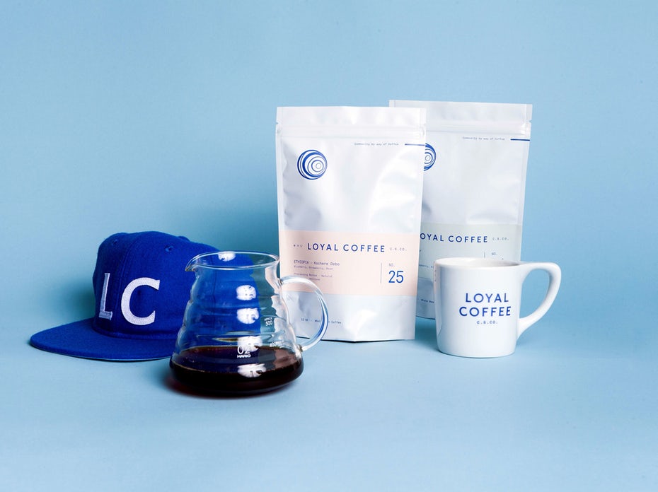
One of the most excellent examples is Snøhetta‘s logo design for Kristin Jarmund Architects. It takes the abbreviation “K J – A”, which allows it to adapt to various layouts upon photographic backgrounds. Another example of awareness to context is the Studio Mast’s logo design for Loyal Coffee. This logo includes several iterations of line-based illustration that adapt to coffee cups, menus and coffee bean packaging.
Here is all the top 9 design trend prediction for 2019. Remember that you do not have to include all of this trend on your website. You can consider the different options and choose the best option for you.