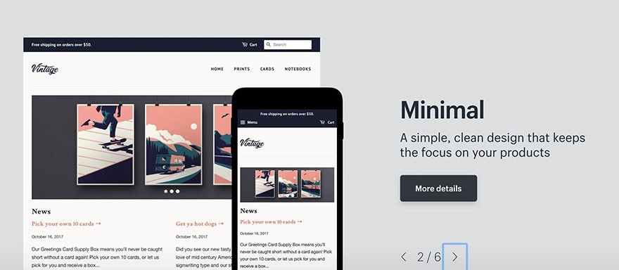
Even your company can offer really good services or amazing products but if your website appears outdated, people will think your brand is of low quality. Therefore, you need to aware of the importance of keeping up to date with design trends.
From the customer’s perspective, they believe that a successful business can maintain its modern appearance and implement the latest design trends. When customers click on your website and they see an old website, then they will assume that it’s because you’re not doing enough business.
So how to make your site look modern? In this article, we have compiled the top 9 design trend prediction for 2019. Here they are:
1. Microinteractions
Microinteractions definition
The term “ microinteractions ” must be no stranger to those who are familiar with UX design. Simply, microinteractions are the contained product moments that do one small task. Those small micro-moments serve for some essential functions. Microinterations can be an excellent tool for communicating feedback or the result of an action. It not only accomplishes an individual task but also enhances the sense of direct manipulation. Besides, mircrointeractions help users visualize the results of their actions and prevent errors.
There are some typical forms of microinteractions, including:
- confirmation messages
- hover animations
- scrolling visuals
- transition animations
- sound effects
- error messages
Although microinteractions aren’t new in 2019, because of their practical benefits to the user experience, customers still love them and come to expect them.
How to apply microinterations in e-commerce?
There is a wide range of applications for microinteractions, but we list some common uses below:
- animations for adding products to the cart
- sound effects to verify changes in order (quantity, color, etc.)
- hover animations or text when users scroll over product pictures
- animated transitions between checkout pages/screens.
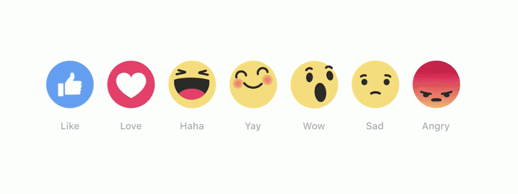
You can use microinteractions as a useful tool for communicating brand and make them become your brand’s signature moments. Facebook’s ‘Like’ reactions are an excellent example of this case. Whenever we see a thumb up icon, we will immediately think about Facebook.

However, when using microinteractions, you need to remember these things. Firstly, microinteractions act as facilitators for interactions, with feedback, notifications, and instructions. Secondly, you should use microinteractions to catch the user’s attention instantly without boring or distracting them. Next, you must understand your users, which will help using microinteractions become more precisely and effectively. And finally, try to microinteractions survive long-term use.
Related: Wix Ecommerce Review – A Platform That May Help You Start Your Business
2. Chatbots

Chatbots are revolutionizing the way businesses interact with their clients. It is a program using AI and sophisticated natural language processing. Now, chatbots offer a deeper level of interaction than ever before.
What it means for e-commerce
Compared to physical stores, one of the inherent disadvantages of e-commerce is the lack of sales assistants. Not only will they answer customer’s questions and overcome obstacles, but they can also use art sales tactics to increase sales opportunities.
It can be said that Chatbots are the best solution to this problem. Although it cannot be as effective as a real person, it can still help in answering the majority of common questions, at any time and in any place.
3. Videos
Video content has increased for many years, but by 2019, we are seeing it heading to some new territories. It can be proved through the example of Youtube. At present, Youtube is the third-most popular website in the world according to Alexa.com, reaching more than 30 percent of computers connected to the Internet every day.
In addition to Youtube, industry analyst Nate Elliott reported that video content was up to 53 times more likely to appear in Google’s search results than text content. Therefore, video content is an ideal way for your business to get more audiences.

How it is applied in e-commerce?
Producing video content gives you an opportunity to market your business in ways that wouldn’t be possible with text content. Text content is just an appropriate medium tool to describe the features of a product, and only video allows potential customers to see a product from multiple angles and in motion, as opposed to static images.
Moreover, through video content, you can gain the trust of potential customers. There are so many fake and poor quality products on the market so customers may be hesitant when they see your product. But with video, you show to them that your product works as advertised. It is also a way for you to stand out from the others, in a competitive industry. According to Hubspot, 76% of markets say product videos increased their sales and 81% of customers admitted watching a video convinced them to buy a product.
You can use video to show how to use your product, which will help you not to answer the question about how to use it. That will save your money and your time.
4. Thumb navigation for mobile

The reasons why you should focus on thumb-friendly design?
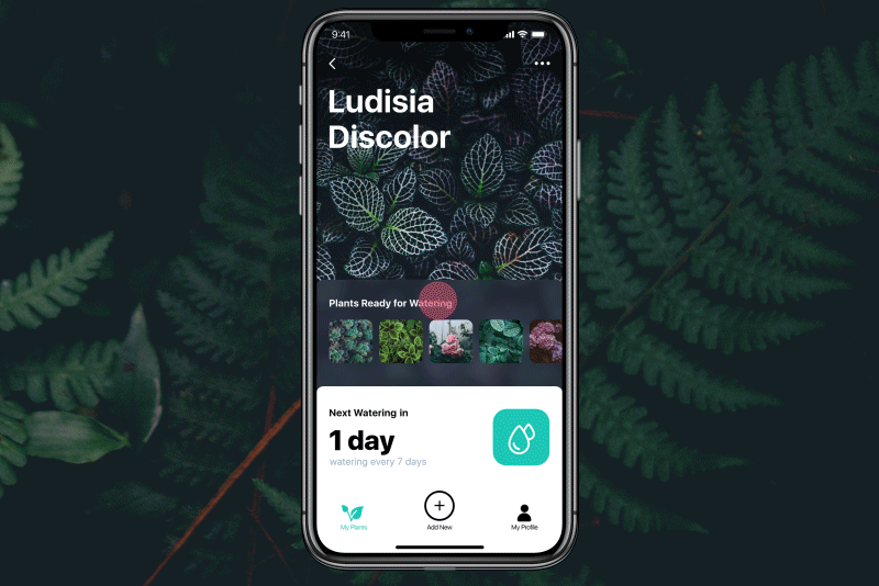
Mobile developers have placed a large focus on how hands adjust to using different mobile devices and experience. The result of a study by UX Matters shows that the majority of people hold their mobile device single-handedly and use the thumb to navigate through the app. Designers and app makers start to think hard about making their apps friendly for navigating with thumbs.
Besides, recently most of the smartphones are launched with bigger screens size. According to a mobile benchmark report produced by Adobe, smartphones with 4” or smaller screens already went down by 11%. The larger screen size also means it will be harder for single-handed thumb navigation since it needs to cover a larger area.
The benefit of thumb-friendly design on e-commerce
By using the thumb zone, consumers will have a more convenient shopping experience. The less they have to think about how to get to where they want to go, the more they can focus on the shopping itself. With a large number of people, this small convenient will be really useful in boost sales.
Therefore, although there are many elements to consider when forming your mobile user experience, it’s extremely important to keep thumb friendliness top-of-mind.
Here just are the first four e-commerce design trends. Let’s look forward to the second part to have more information about the top 9 design trends prediction for 2019.


